
BRANDING+
PACKAGING
CLIENT
BEERENBERG FARMS
SERVICES
strategy | packaging | messaging | illustration
OUTCOME
LAUNCHED WITH SUCCESS. RECEIVED BY SPROUTS AND OTHER MARKETS.
OPPORTUNITY
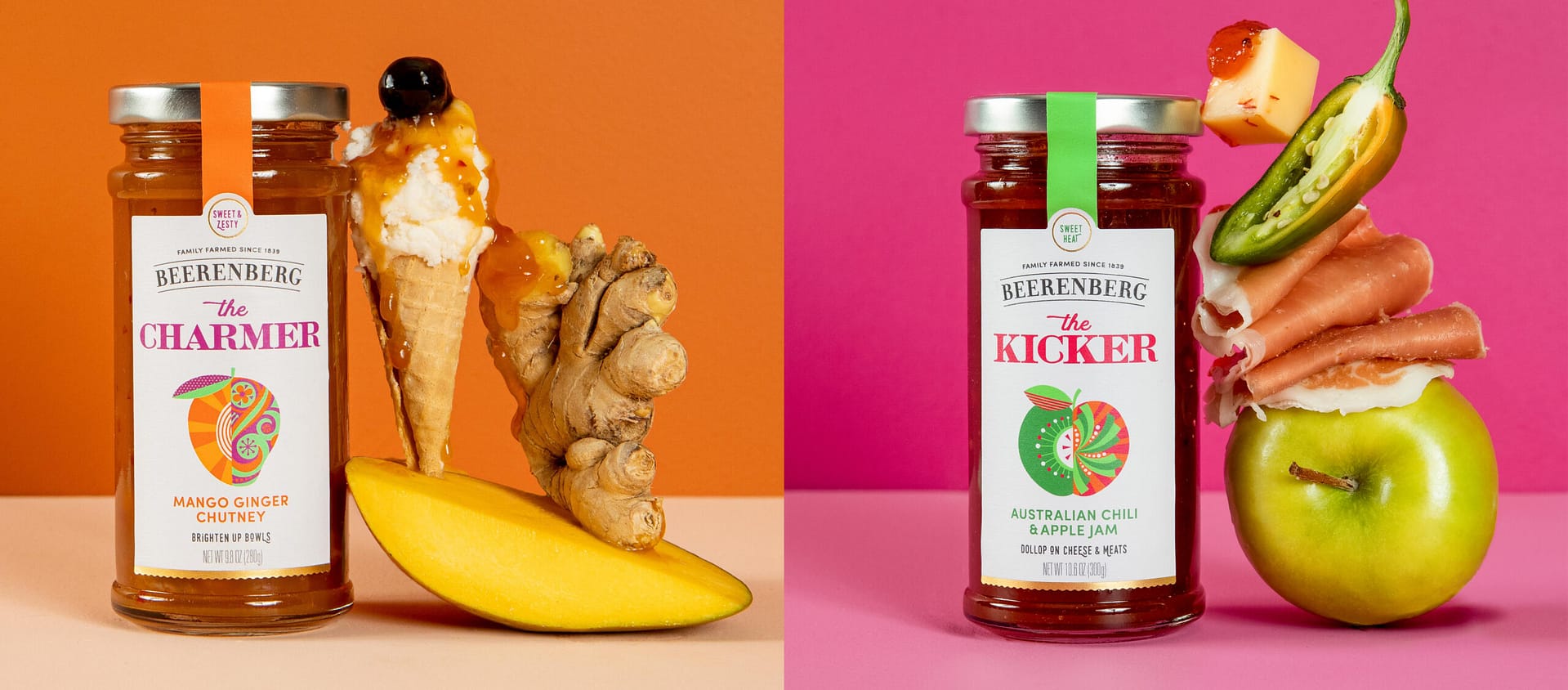
We brought a historic Australian brand to the US market, translating their beloved yet cheeky brand personality to a hard working, clear communicating, (yet still playful) rendition.
We started with strategy, digging into the consumer and their mindset to develop the brand positioning. On the back end, we did quantitative research (sampling) across the country to reveal which skus would succeed in the mainstream set. Once we had our lineup, we dove into design, product naming and messaging.
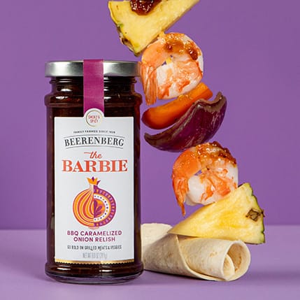
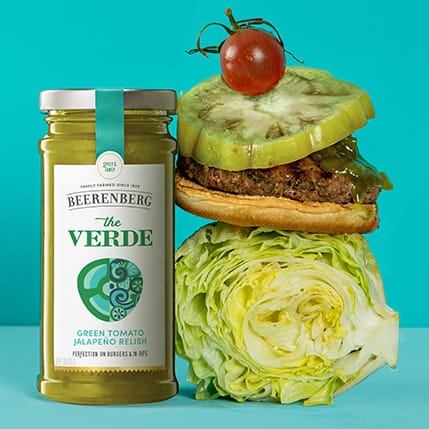
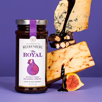
Custom illustration provided charm and Aussie quirk, and allowed us to feature locally grown ingredients and flavors. We went with a warm neutral for the paper color, and vibrant, juicy colors — earthy but optimistic and fresh. Icons offer serving suggestions and flavor cues right on the front of pack.
Playful product naming, such as "The Mama" and "The Royal," entice consumers and pique curiosity, and are paid off with colorful flavor stories.

MORE BRAND LOVE
MORE BRAND LOVE
Adams 1888brand concept | brand ID | packaging | everything
For Real blendsbrand concept | naming | brand ID | packaging
Hammond'sbranding | naming | packaging

Mr Bingbranding | packaging
Noosa Yoghurtlogo | brand concept | packaging | illustration
Mood by Boochcraftlogo | brand concept | packaging | illustration
Cliopackaging | photography

Finallylogo | brand concept | packaging | website
Tailwind Nutritionstrategy | logo | packaging | messaging | web
True Made Foodslogo | brand concept | packaging | web
Waka Coffeestrategy | logo | brand concept | packaging
Dosa By Dosasignage | packaging | messaging
All Grownnaming | brand concept | logo | packaging
PACKAGING DESIGN
BRAND STRATEGY
COPYWRITING
NAMING
BRAND VOICE
BRAND IDENTITY
LOGOS
WEBSITES