
BRANDING+
PACKAGING
BRAND
noosa yoghurt
SERVICES
logo | brand concept | packaging | illustration
RESULTS
In over 40k stores
$200+ m in sales
75k instagram followers
OPPORTUNITY
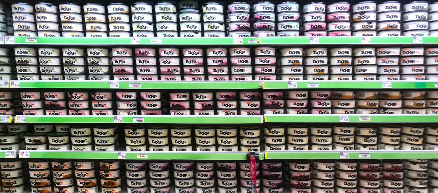
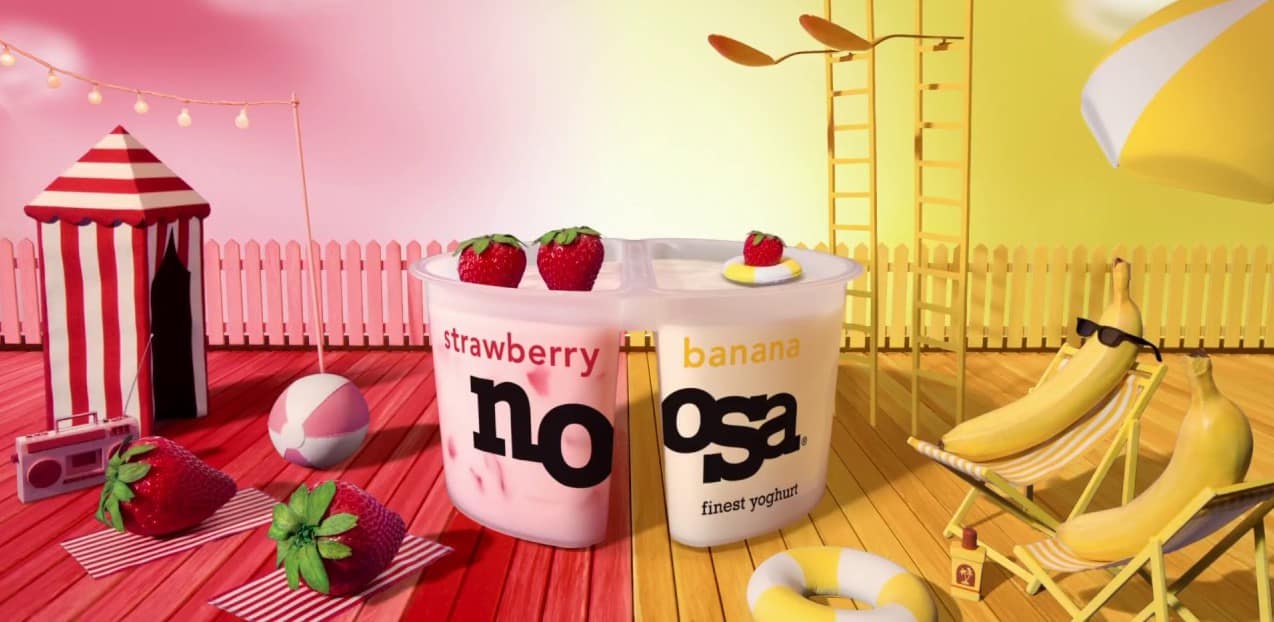
Brandarella partnered with the noosa co-founders from the brand inception, carving out a unique brand position, voice and look. At launch, the yogurt aisle was humming with nutritional claims. We led with bold flavor and indulgent taste. We expressed that with big, stylized silhouettes on delicious jammy colors, showing off the product in clear tubs. Our original design still holds, and has survived several company acquisitions unscathed (very rare!).


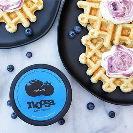
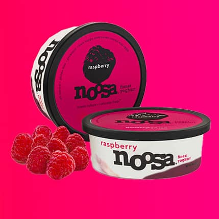
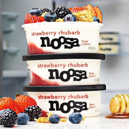
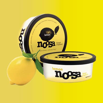
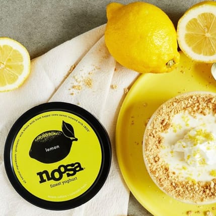
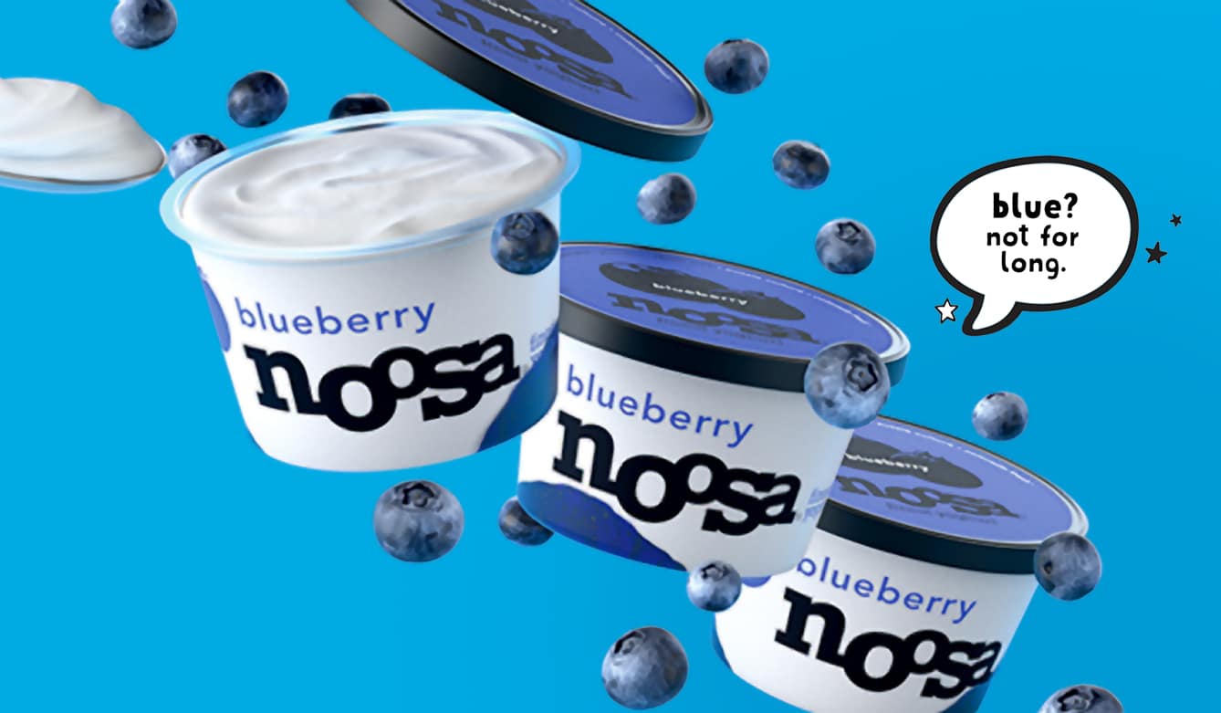
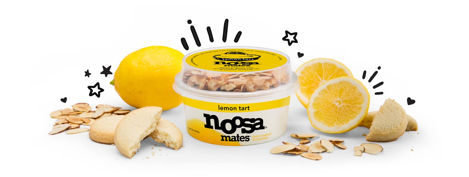
We grab attention in-aisle with a frisky, superbold logo on an uber simple, clear, odd-sized tub. The unusual shape is arresting, and the clear material allows the high quality fruits be visible at a glance. Giant, black fruit illustrations contrast juicy, joyful colors on the lids.
LOGO
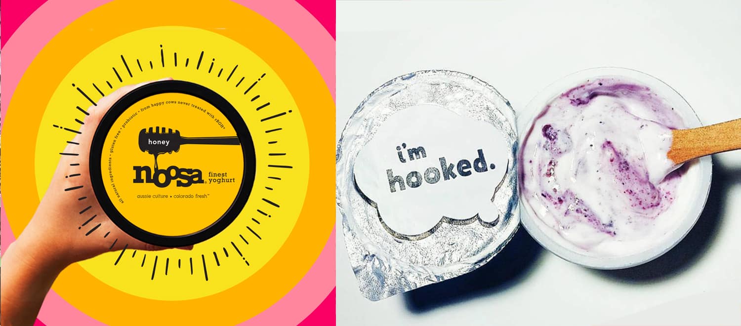
Playful, expressive and bold, the logo channels the brand personality and positioning: joy, indulgence and satisfaction. Strong enough to sit on top of the clear tubs, it's visible across the yogurt aisle, allowing the brand to "pop" and to be memorable.
MORE BRAND LOVE
MORE BRAND LOVE
Adams 1888brand concept | brand ID | packaging | everything
For Real blendsbrand concept | naming | brand ID | packaging
Hammond'sbranding | naming | packaging
Mr Bingbranding | packaging
Mood by Boochcraftlogo | brand concept | packaging | illustration
Cliopackaging | photography
Finallylogo | brand concept | packaging | website
Tailwind Nutritionstrategy | logo | packaging | messaging | web
True Made Foodslogo | brand concept | packaging | web
Waka Coffeestrategy | logo | brand concept | packaging
Beerenbergstrategy | packaging | messaging | illustration
Dosa By Dosasignage | packaging | messaging
All Grownnaming | brand concept | logo | packaging
PACKAGING DESIGN
BRAND STRATEGY
COPYWRITING
NAMING
BRAND VOICE
BRAND IDENTITY
LOGOS
WEBSITES